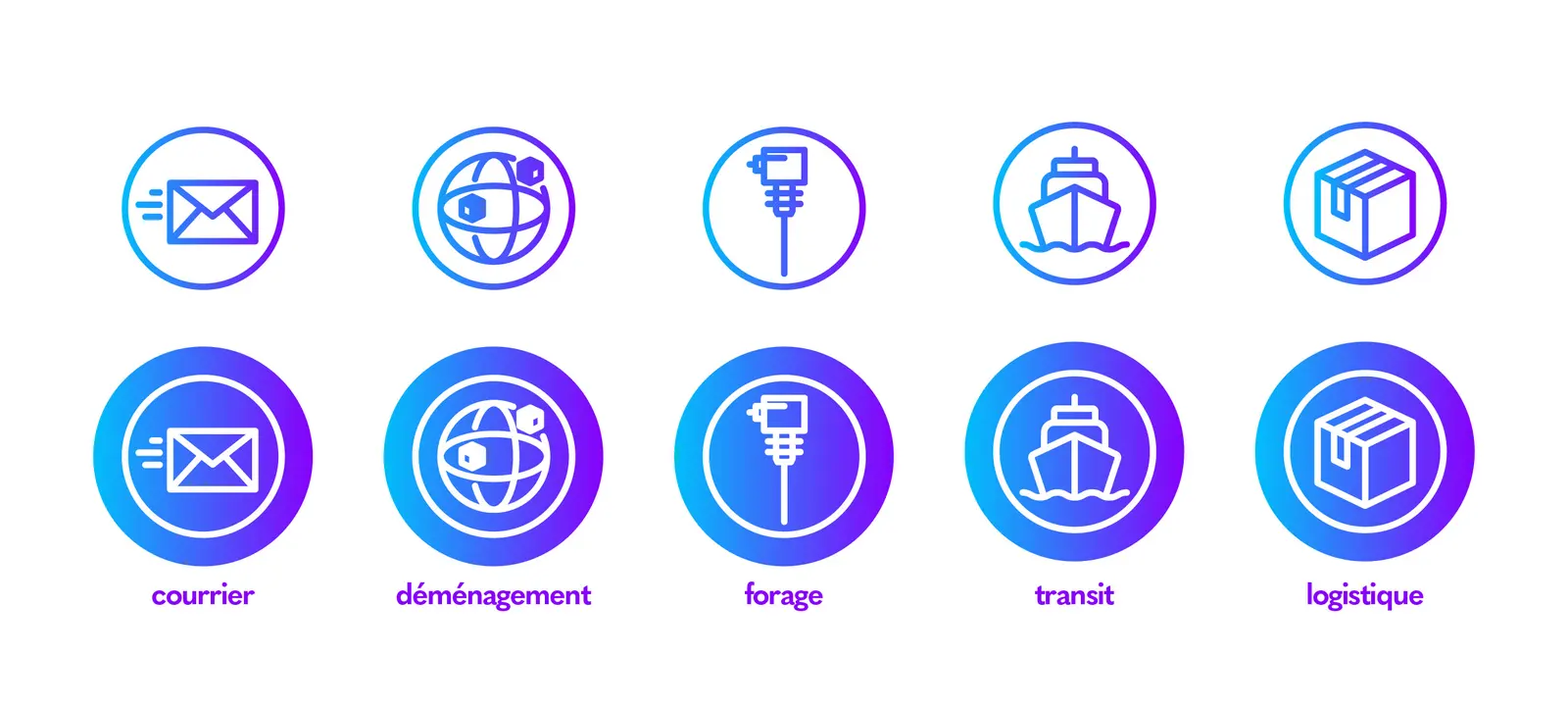

Technology is evolving at such a speed that today we are forced to be constantly on the alert. The work on the “Globetrans” identity was a real challenge. Succeed in keeping the soul of the brand while modernizing it.
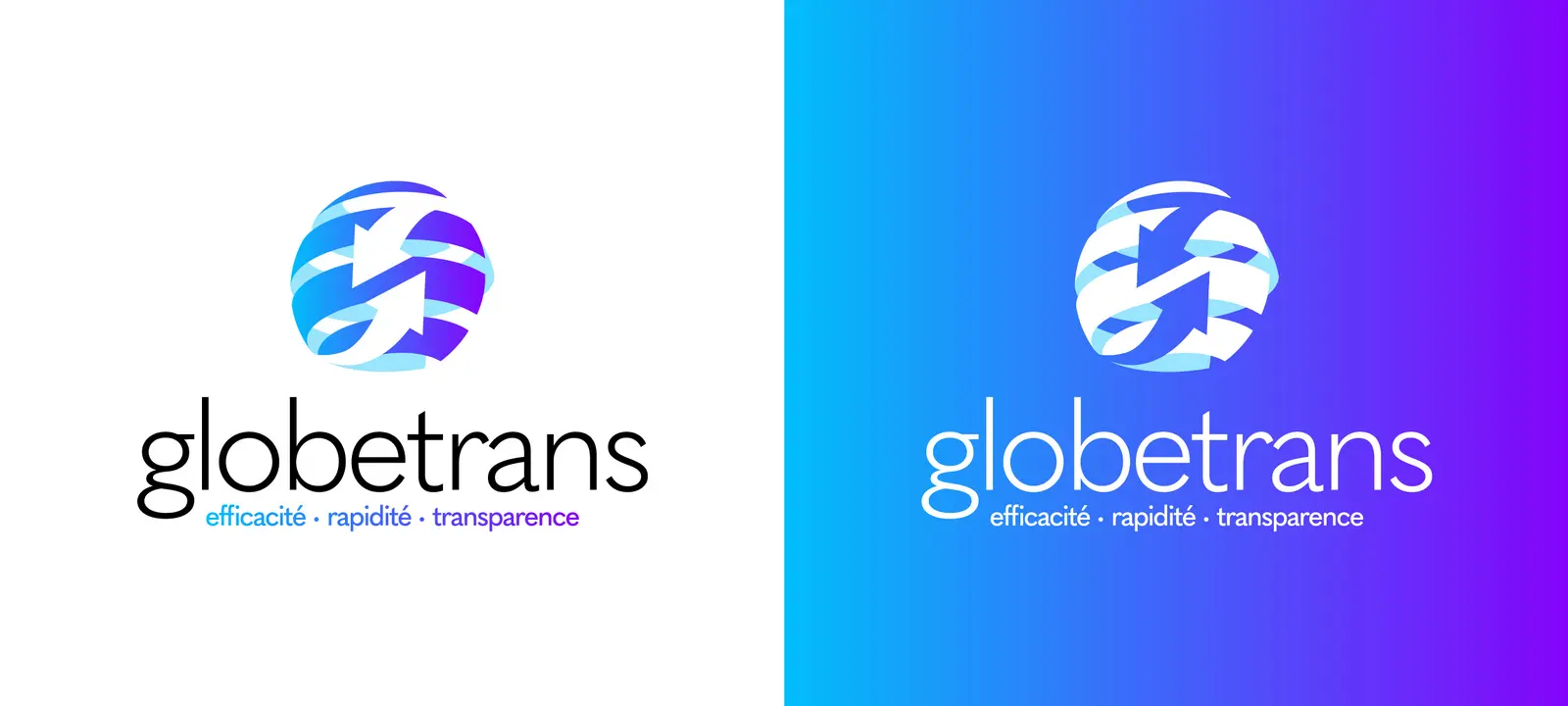
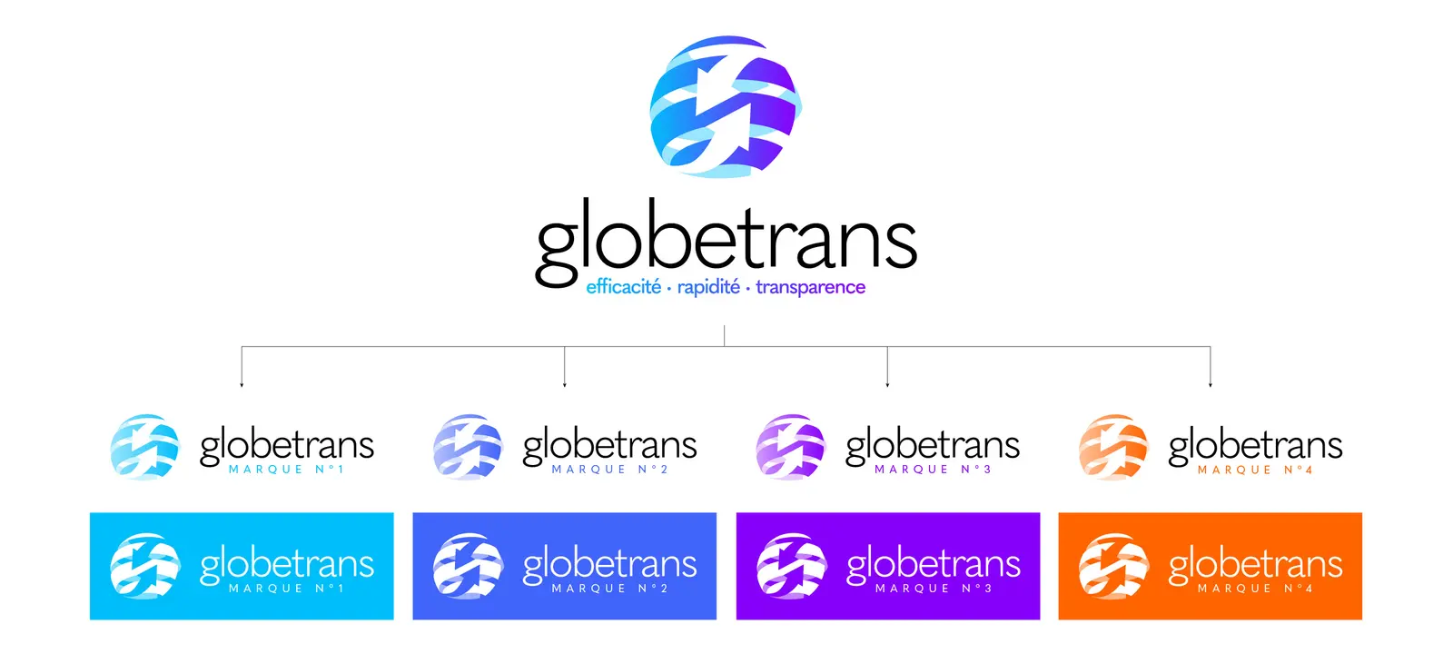
For this, it was essential to preserve the iconic blue color of “Globetrans”. To this, an electric purple adds a touch of dynamism signifying a real desire for evolution. A brand focused on the future.
The main characteristic of freight transport is above all a means of bringing people together and of exchanging. This is why it was important for us to keep two of the three arrows of the anthology logo.
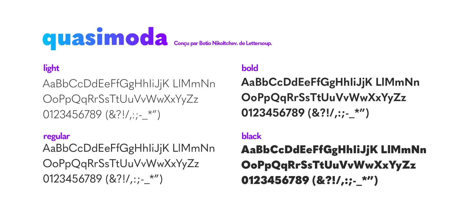
A fine typography calms the game and establishes the brand in its time. She comes to reassure me. In addition, the baseline “reliability – speed – transparency” is the cornerstone of the logotype, recalling the 3 key words that have made “Globetrans” its international reputation.
Project images